Lecture 3 (Visualising Data: Plots)
Reading
Resources
Summary
In this lecture we will learn how to visualise data in terms of plots. We will also look into the differences between plots and how to choose a suitable visualisation method for a specific problem. Finally, we will conclude with and example. This lecture will contain a less content than others.
Visualising Data
A picture plot is worth a thousand word, is a popular phrase, that conveys the use the power of data visualisation. This is meant to convey the message that you can understand more from a single image than a text of words. In our case, when we analyse plots generated from the data we will be able to draw deeper conclusions than we would have by just looking at the data through tables. So far that is what we have been doing. Although tables of data are great for, initial interpretation, transformation e.t.c, it lends us no way of understanding the data. Visualising data in forms of images(plots), gives us a tool to analyse the data and gain a deeper understanding of it, it enables us, in most cases, to draw far deeper conclusion of the data than would be possible otherwise.
Chosing the right Plot
There are many ways to represent the data, but one has to be mindfull of the type of plot used. Choosing the right plot is an important problem we will be faced with when visualising data. The plot should convey a conclusion that can be drawn without ambiguity. That is why it is important to consistently use propper labeling and descriptive captions. Seeing an image without context or understanding will render the image uninterpretable, and in cases, lead the viewer to draw the wrong conclusion.
Examples of plots
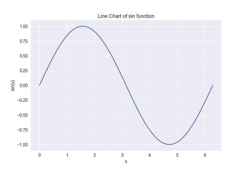
Let's begin by creating a simple plot of a sin function. We are not able to plot a continous line chart, we need to provide a set of data points
We can do this in the following way
import numpy as np
import matplotlib.pyplot as plt

n_steps = 1000 # Size of partition of the x-axis
x = np.linspace(0, 2*np.pi, n_step)
y = np.sin(x)
plt.plot(x,y)
plt.xlabel("x")
plt.ylabel("sin(x)")
plt.title("Line Chart of sin function")
plt.show()
import numpy as np
import matplotlib.pyplot as plt
n_steps = 1000 # Size of partition of the x-axis
x = np.linspace(0, 2*np.pi, n_step)
y = np.sin(x)
plt.plot(x,y)
plt.xlabel("x")
plt.ylabel("sin(x)")
plt.title("Line Chart of sin function")
plt.show()n_steps = 1000
x <- seq(0, 2*pi, 1/n_steps)
y <- sin(x)
// Here it is always easier to work with dfs
df <- tibble(x=x,y=y)
df %>%
ggplot() +
geom_path(mapping=aes(x=x, y=y)) +
labs(title="Line Chart of sin function",
x="x",
y="sin(x)")n_steps = 1000
x <- seq(0, 2*pi, 1/n_steps)
y <- sin(x)
// Here it is always easier to work with dfs
df <- tibble(x=x,y=y)
df %>%
ggplot() +
geom_path(mapping=aes(x=x, y=y)) +
labs(title="Line Chart of sin function",
x="x",
y="sin(x)")
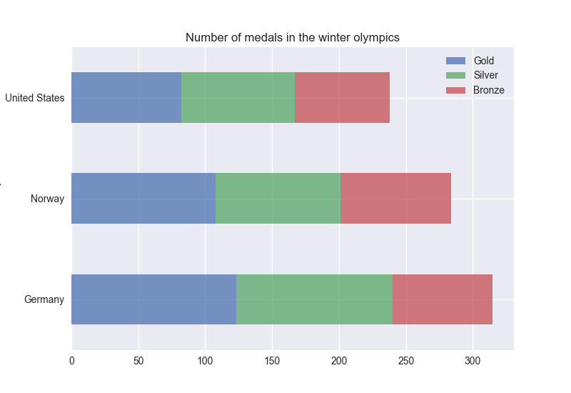
Since we want to be working with Dataframes, it would be nice to directly visualise data from them. Thankfully, this a feature that has support in both Python and R. To show a simple example of this we can use the Winter_medals2022-11-03.csv data.
We can visualise the number of medals won by the 3 countries with the highest number of total medals in the following way
# Process data
df = pd.read_csv("./data/Winter_medals2022-11-03.csv")
top3 = df[["Country", "Total"]].groupby("Country").sum().sort_values("Total", ascending=False).head(3).index
df = df.loc[df["Country"].isin(top3)][["Country", "Gold", "Silver", "Bronze"]].groupby("Country").sum()

# Plot data, use stacked to get nicer plot.
df.plot.barh(stacked=True)
# Process data
df = pd.read_csv("./data/Winter_medals2022-11-03.csv")
top3 = df[["Country", "Total"]].groupby("Country").sum().sort_values("Total", ascending=False).head(3).index
df = df.loc[df["Country"].isin(top3)][["Country", "Gold", "Silver", "Bronze"]].groupby("Country").sum()
# Plot data, use stacked to get nicer plot.
df.plot.barh(stacked=True)df <- read_csv("./data/Winter_medals2022-11-03.csv")
top3 <- df %>%
group_by(Country) %>%
summarise(Gold=sum(Gold)) %>%
arrange(desc(Gold)) %>%
select(Country) %>%
head(3)
df <- df %>%
filter(Country %in% top3$Country ) %>%
group_by(Country) %>%
summarise(Gold = sum(Gold), Silver = sum(Silver), Bronze = sum(Bronze))
df %>%
pivot_longer(cols = -Country, names_to = "Medal", values_to = "Count") %>% # We will go through pivoting in a few lectures
ggplot(aes(x = Count, y = Country, fill = Medal)) +
geom_bar(stat = "identity") +
labs(x = "Medals", y = "Country")df <- read_csv("./data/Winter_medals2022-11-03.csv")
top3 <- df %>%
group_by(Country) %>%
summarise(Gold=sum(Gold)) %>%
arrange(desc(Gold)) %>%
select(Country) %>%
head(3)
df <- df %>%
filter(Country %in% top3$Country ) %>%
group_by(Country) %>%
summarise(Gold = sum(Gold), Silver = sum(Silver), Bronze = sum(Bronze))
df %>%
pivot_longer(cols = -Country, names_to = "Medal", values_to = "Count") %>% # We will go through pivoting in a few lectures
ggplot(aes(x = Count, y = Country, fill = Medal)) +
geom_bar(stat = "identity") +
labs(x = "Medals", y = "Country")
This is by no means comprehensive, but is meant to show you how to plot in practice. You can find more examples in the provided reading material. We will explore how to use plots to draw conclusions in the next plot.